Introduction
Color is one of the most important—and most misunderstood—parts of digital design. In Affinity apps, features like document color settings, color management, and swatches give you powerful control, but they can feel confusing at first.
By the end of this guide, you’ll understand how to:
- Set up the correct document color mode
- Manage color profiles without stress
- Create, save, and reuse swatches properly
- Avoid common color mistakes when exporting
Common Questions & Pain Points
Here are the most frequent struggles beginners and intermediates face:
- Why do my colors look different after exporting?
- What’s the difference between RGB and CMYK in Affinity?
- When should I change document color settings?
- Why do my swatches disappear in new documents?
- What are global swatches and why should I use them?
- How do color profiles affect my design?
- Why do printed colors look dull compared to my screen?
- How do I reuse brand colors across multiple files?
Today, we will address all the questions mentioned above. If you’re experiencing any of these issues, continue reading – this guide is definitely here to help you out!
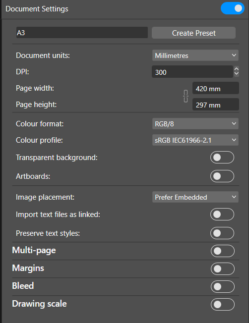
1: Understanding Document Color Settings
What to do:
When creating a new document, choose the correct color format and color profile in the New Document dialog.
Warnings / Prep:
- Changing color mode later can slightly shift colors.
- Always decide before heavy design work.
Tips & Best Practices:
- Use RGB for digital (web, UI, social media).
- Use CMYK for print projects.
- Match document DPI to output (72–144 for screen, 300 for print).
Helpful Tools:
- New Document dialog
- Document Setup → Color tab
2: RGB vs CMYK — Choosing the Right Color Mode
What to do:
Select RGB or CMYK based on where your design will be used.
Warnings:
- RGB colors can’t always be reproduced in CMYK.
- CMYK files may look dull on screen—that’s normal.
Tips:
- Stay in RGB as long as possible for digital work.
- Ask printers which CMYK profile they prefer.
- Avoid switching modes repeatedly.
Resources:
- Printer documentation
- Affinity Color Panel
3: Working with Color Profiles & Color Management
What to do:
Choose an appropriate ICC color profile for your document.
Warnings:
- Using the wrong profile can cause unexpected color shifts.
- Don’t mix profiles without knowing why.
Tips:
- sRGB is safest for web.
- Adobe RGB gives more color range for photos.
- Use printer-provided ICC profiles for print accuracy.
Tools:
- Document Setup
- Soft Proof Adjustment (for print preview)
4: Creating and Managing Swatches in Affinity
What to do:
Add colors you frequently use to the Swatches panel.
Warnings:
- Document swatches don’t carry over automatically.
- Application swatches are global across files.
Tips:
- Save brand colors as Application Swatches.
- Rename swatches clearly (e.g., “Brand Blue”).
- Keep swatch lists clean and minimal.
Tools:
- Swatches Panel
- Add Application Palette
5: Using Global & Document Swatches Effectively
What to do:
Use Global Swatches so one change updates all uses.
Warnings:
- Regular swatches won’t update automatically.
- Forgetting to use global swatches leads to inconsistencies.
Tips:
- Always use global swatches for logos and UI kits.
- Combine global swatches with styles for efficiency.
- Lock palettes once finalized.
Helpful Features:
- Global Color option
- Styles Panel
6: Ensuring Color Consistency Across Files & Exports
What to do:
Check export settings carefully.
Warnings:
- Exporting with the wrong color profile causes shifts.
- Some platforms ignore embedded profiles.
Tips:
- Embed color profiles when exporting.
- Use soft proofing before print export.
- Test exports on different screens if possible.
Tools:
- Export dialog
- Soft Proof Adjustment
Troubleshooting & Common Mistakes
| Problem | Cause | Solution |
|---|---|---|
| Colors look washed out | Wrong color profile | Switch to correct ICC profile |
| Swatches missing | Used document palette | Save as application palette |
| Print looks dull | CMYK limitations | Adjust colors with soft proof |
| Inconsistent brand colors | No global swatches | Convert to global colors |
Frequently Asked Questions (FAQs)
Q: Can I change RGB to CMYK later?
Yes, but expect slight color shifts.
Q: What’s the best color profile for web?
sRGB.
Q: Why do my colors change on export?
Usually due to profile conversion or missing embedding.
Q: Are global swatches really necessary?
Yes—especially for branding and UI work.
Glossary (Simple Definitions)
- RGB: Color model for screens (Red, Green, Blue)
- CMYK: Color model for printing (Cyan, Magenta, Yellow, Black)
- ICC Profile: File that controls color interpretation
- Swatch: Saved color
- Global Swatch: Swatch that updates everywhere when edited
- Soft Proofing: Simulating print colors on screen
Conclusion
Color management in Affinity doesn’t have to be intimidating. Once you understand document color settings, profiles, and swatches, your designs become more predictable, professional, and reusable. Start with the right setup, rely on global swatches, and always think about where your design will end up.
Now go tweak those colors with confidence—and actually trust what you see on screen.
